A mental wellness logo serves as the first point of connection between your practice and those seeking support. It communicates safety, hope, and healing before a single word is spoken.
We at Devine Interventions understand that thoughtful design choices can reduce barriers to mental health care. Your visual identity shapes how clients perceive your services and influences their willingness to reach out for help.
Elements of Effective Mental Wellness Logo Design
Color Psychology and Emotional Impact
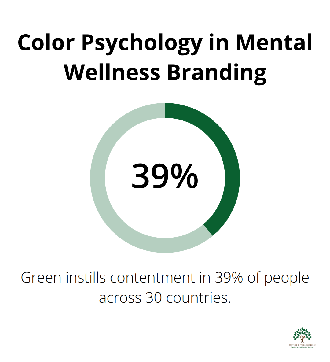
The colors you select for your mental wellness logo directly shape how potential clients perceive your practice. Research involving 30 countries found that green instills contentment in 39% of people, while blue promotes feelings of trust and reliability. Blue stands as the most effective color for mental health services because it reduces anxiety and creates immediate emotional safety.

Green follows as the second-best choice, particularly as green serves as the designated color for mental health awareness campaigns, symbolizing new life, renewal, and growth. Red should be avoided entirely in mental wellness branding, as studies show it triggers stress responses and creates urgency that contradicts therapeutic environments. Soft blues and gentle greens work together to establish the calm foundation your clients need.
Symbolic Elements That Build Trust
Peaceful symbols create instant recognition and emotional connection with your audience. The lotus flower represents spiritual awakening and resilience, making it ideal for practices focused on healing and mindfulness. Butterflies symbolize transformation and rebirth, resonating strongly with clients who seek personal growth and recovery.
Nature-inspired elements like gentle waves or trees communicate harmony and provide grounding. Medical symbols like crosses or caduceus designs should be avoided, as they create clinical associations that can intimidate potential clients. The dove remains overused in mental health branding and lacks distinctiveness (though it still conveys peace effectively).
Typography That Communicates Compassion
Soft, rounded fonts convey approachability and warmth, while sharp, angular typefaces create distance and formality. Sans-serif fonts work best for mental wellness logos because they appear clean and modern without overwhelming viewers. Script fonts should be avoided entirely as they reduce readability and can appear unprofessional on digital platforms.
Your typography must remain legible at small sizes, particularly for social media profiles and mobile applications. Headspace successfully uses custom rounded typography that reinforces their calm brand message, while Calm employs simple, clean lettering that enhances their peaceful positioning (both demonstrate effective font selection). Test your font choices across multiple platforms to maintain consistency and professional appearance.
These foundational elements work together to create logos that not only look professional but also communicate the safety and hope your clients need. The next step involves applying specific design principles that transform these elements into cohesive, effective mental health branding.
Design Principles for Mental Health Branding
Simplicity Creates Immediate Trust
Mental health logos must communicate instantly without overwhelming potential clients. Aesop demonstrates this principle with their earthy brown and beige palette combined with minimalist black and white elements, creating sophisticated yet approachable branding. Your logo should contain no more than three core elements – one primary symbol, clean typography, and a maximum of two colors.
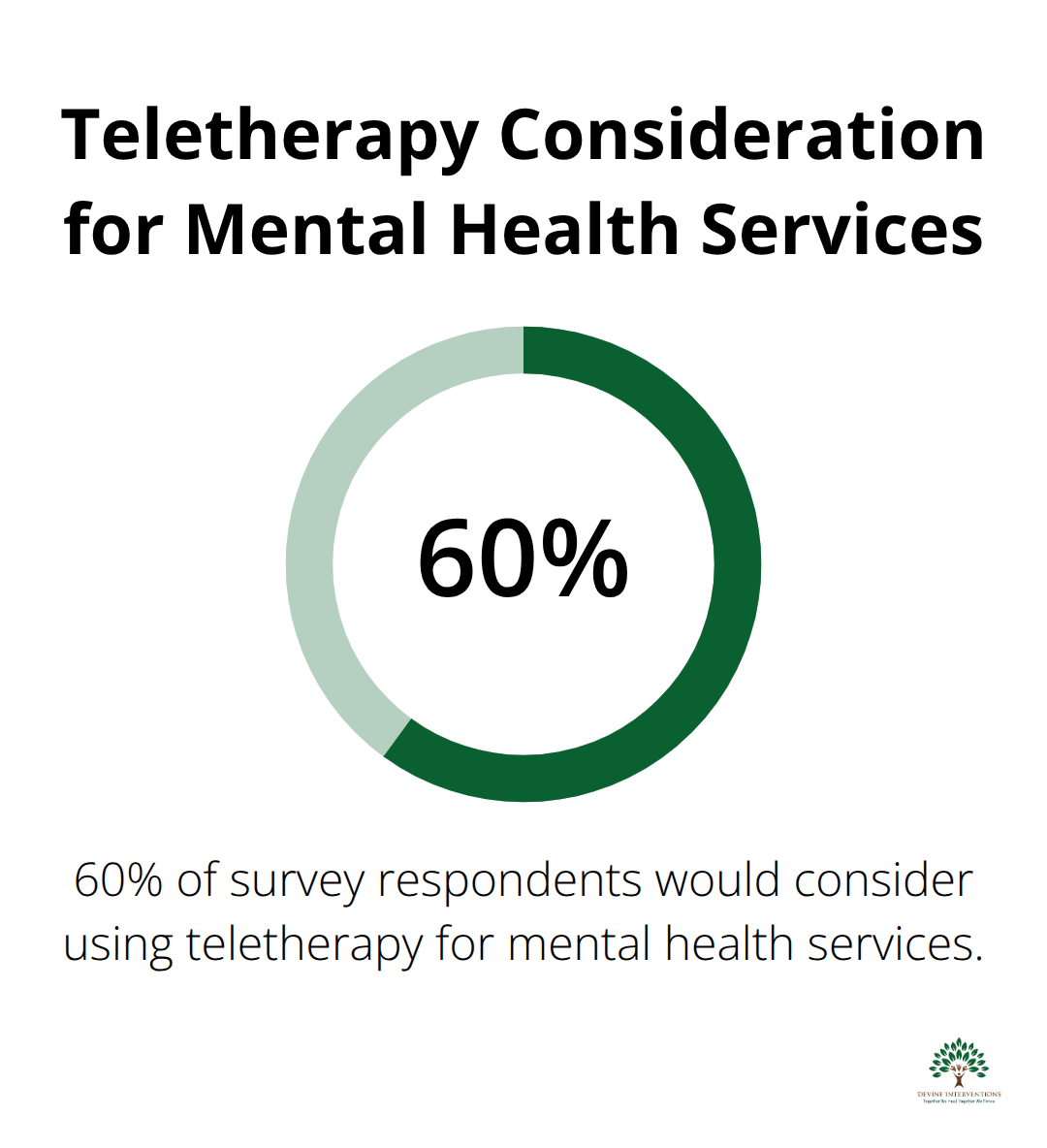
Complex designs fail on mobile screens where 60% of survey respondents would consider using teletherapy for mental health services, and busy visuals increase anxiety rather than reduce it.

Test your logo at 16×16 pixels to verify it remains recognizable on social media platforms and mobile apps.
Cultural Sensitivity Drives Connection
Your visual choices must resonate across diverse communities without excluding potential clients. Avoid symbols that carry specific religious connotations unless your practice serves that particular community exclusively. The lotus flower, while popular in mental health branding, may alienate Christian clients who prefer more neutral imagery.
Choose universally calming elements like gentle waves or abstract shapes that transcend cultural boundaries instead. Headspace successfully uses orange and blue combinations that appeal across demographic lines, while many competitors fail by using culturally specific imagery that limits their reach.
Professional Warmth Balances Authority and Accessibility
Mental health logos require a delicate balance between clinical competence and emotional warmth. Medical symbols like crosses or stethoscopes create barriers by appearing too clinical, while overly casual designs undermine professional credibility. Calm achieves this balance perfectly with sky blue as their primary color, supported by clean typography that suggests expertise without intimidation.
Your logo should pass the business card test – professional enough for referral networks yet welcoming enough that struggling individuals feel safe approaching your practice (avoid gradients and shadows that appear dated). Choose colors that reproduce consistently across print and digital media to maintain professional appearance.
Scalability Across All Platforms
Your mental wellness logo must work effectively from business cards to billboards. Design elements that look perfect at large sizes often become illegible when reduced for social media avatars or mobile app icons. Vector-based designs are created using mathematical equations, making them infinitely scalable without losing quality, while bitmap images pixelate and blur at different sizes.
Test your logo across every platform where clients might encounter your brand – Instagram profiles, Google My Business listings, email signatures, and printed materials. A logo that fails on any single platform creates inconsistent brand recognition and potentially lost connections with those seeking help.
These design principles form the foundation for effective mental health branding, but even well-intentioned designers make critical mistakes that can undermine their efforts. Understanding these common pitfalls helps you avoid the visual elements that accidentally create barriers instead of bridges to care.
Common Mistakes to Avoid in Mental Wellness Logos
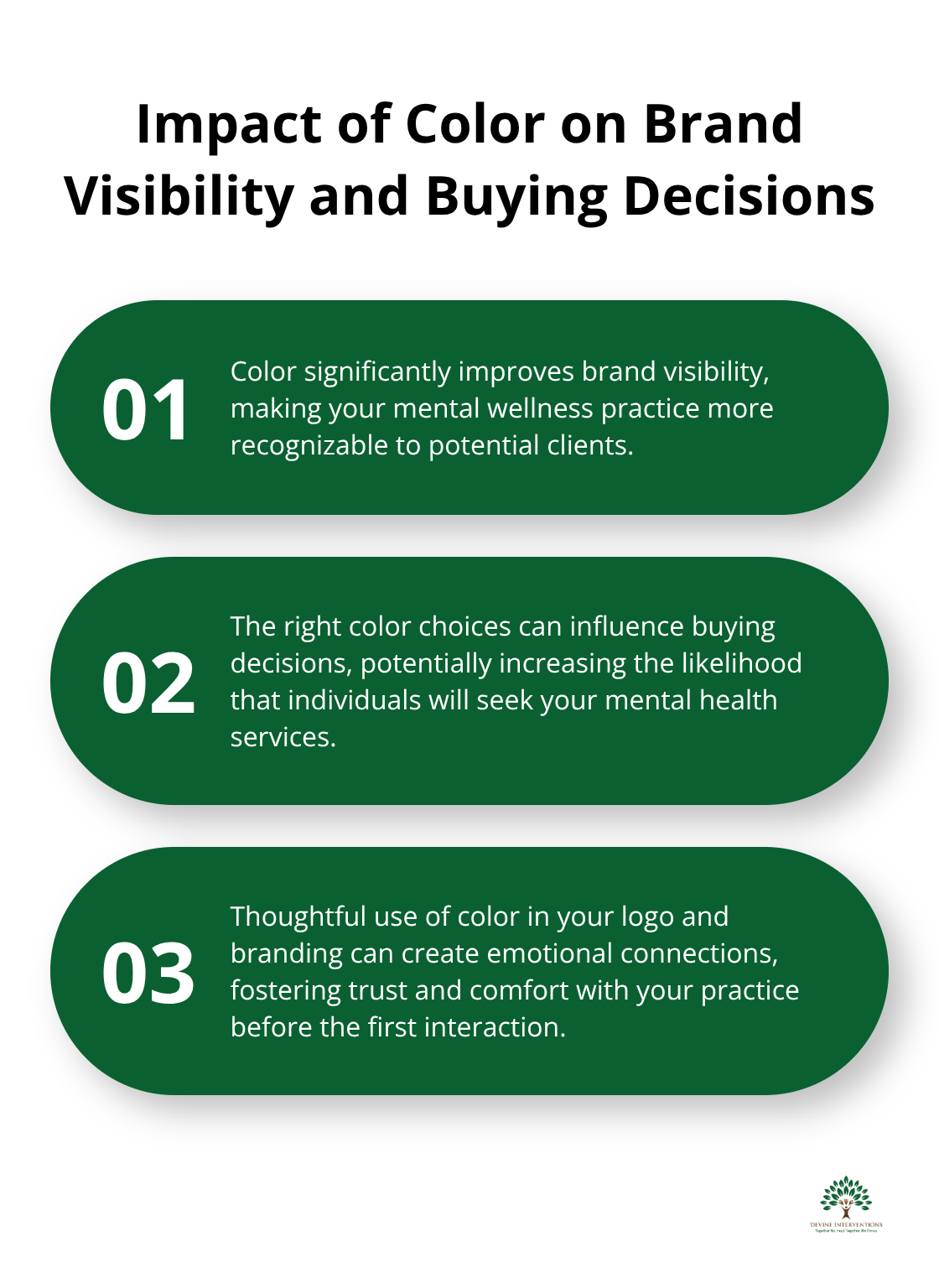
Medical crosses, stethoscopes, and brain imagery instantly transform your mental wellness logo into a clinical barrier that intimidates vulnerable clients. These symbols trigger associations with hospitals and medical procedures rather than emotional safety and healing. Research shows that 48–85% of people say color improves brand visibility and influences their buying decisions, yet many mental health practices choose sterile white backgrounds with medical blue accents that feel cold and unwelcoming. The most damaging mistake involves using clichéd imagery like puzzle pieces to represent autism spectrum disorders or broken chains for addiction recovery, which perpetuate harmful stereotypes and suggest clients are fundamentally broken rather than whole people seeking support.

Overly Clinical Symbols That Create Distance
Hospital-style imagery pushes away the very people who need mental health support most. Stethoscopes and medical crosses signal clinical environments that many clients associate with judgment and cold treatment. Brain scans and anatomical imagery reduce complex human experiences to medical conditions rather than acknowledging the whole person. White coats and clipboard imagery reinforce power imbalances that prevent authentic therapeutic relationships. These visual choices communicate that your practice treats symptoms rather than supporting human beings on their wellness journey.
Stereotypical Elements That Harm Communities
Generic therapy imagery like couches, talking heads, or puzzle pieces reduces complex human experiences to oversimplified visual metaphors. Puzzle pieces particularly harm neurodivergent communities by implying something is missing or needs fixing. Religious symbols like crosses limit your practice to specific faith communities, while abstract human figures often appear childish and unprofessional. Hands reaching upward suggest desperation rather than empowerment (avoid maze imagery that implies confusion rather than clarity and hope). These symbols fail to acknowledge the diverse backgrounds and unique journeys of people seeking mental health support.
Complex Designs That Fail on Mobile Platforms
Logos packed with multiple symbols, gradients, and intricate details become illegible when scaled down to social media profile sizes or mobile app icons. Instagram profiles display logos at just 150×150 pixels, where complex designs turn into unrecognizable blurs that fail to build brand recognition. Gradients and drop shadows that look impressive on business cards disappear entirely on digital platforms. Text-heavy logos become completely unreadable at small sizes, forcing potential clients to guess your practice name. Vector-based designs solve scalability issues, but only when kept simple with bold, clear elements that maintain recognition from billboard size down to favicon dimensions (test your logo at 16×16 pixels to verify mobile readability).
Final Thoughts
Your mental wellness logo serves as the bridge between those who seek help and the support they desperately need. Every design choice either welcomes vulnerable individuals or creates another barrier in their path to healing. The most effective mental wellness logos combine calming blues or greens with simple, nature-inspired symbols that communicate safety without clinical coldness.
Typography must remain readable across all platforms, from business cards to mobile screens where most people first encounter your practice. Medical imagery, stereotypical symbols, and complex designs that fail to scale properly transform your logo from a beacon of hope into an obstacle. These mistakes prevent connections with those who need care most (especially on mobile platforms where 60% of people consider teletherapy options).
We at Devine Interventions create thoughtful branding that reflects compassionate care through comprehensive mental health services. Your logo represents more than aesthetic choices – it communicates your commitment to treat whole people with dignity and respect. When you design thoughtfully, your mental wellness logo offers hope before clients even walk through your door.


